Wednesday, 27 February 2013
Monday, 25 February 2013
Final psychosis trailer
We have produced our final trailer for our Psychosis production. After our first upload, I recognised the quality was quite poor and some clips were missing due to the rendering from Sony Vegas.
THIS VIDEO IS THE DRAFT
Therefore, I had to reupload the footage, so this is what we've got to present as our final trailer. An analysis of this will be included in our evaluation, on how we challenged and employed certain horror trailer stereotypes.
FINAL TRAILER
Audience feedback
With the help of previous research such as looking at other posters and using a questionnaire to construct our arious media texts, we have used facebook to help us meet the audience's wants and needs, by allowing their input to change our media texts.


Saturday, 23 February 2013

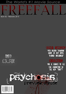
First draft of magazine cover
We have produced our first draft of the magazine cover. This has been posted on our facebook page, available for review and feedback.


Flat plan for 2D production
In preparation for my production, our group has planned out flat plans based on the research we have carried out. A flat plan is marking boxes on where certain features should be, such as cover lines, masthead, and focal point. Ensuring we have a flat plan will make it easier for us when we go to produce our actual covers, since all we have to do is slot images and text in place depending on where the boxes are placed. The flat plans were creating in Adobe InDesign Below, I have previewed our flat plans, as well explained the composition of our covers. I will also analyse the foundation of our poster with such techniques as semiotics and uses & gratifications.
Magazine Flat Plan


The yellow block will include the main focus point of the poster. In this block, the idea is to have the killer, Rachel, show half her face and for her to be covered with a black surrounding, similar to the poster research I've carried out. This will give a fear to the unknown, since the audience won't be able to depict her identity. This satisfies
The green blocks will feature the main actors in this film. In terms of posters, this will be our "star attraction" that will attract audiences. This provides information, since the audience may be attracted to the film after noticing a big name on the poster. However, we are not able to exploit the "star status" completely, since our actors aren't well known. Therefore we are just following the convention of horror posters by using this feature in a similar way to they do, or else the poster may not provide enough information to intrigue our target audience.
Magazine Flat Plan

The yellow block that I've put in the background is meant to represent the stock photo we aim to use in our poster. This will cover the whole poster, since this is what will be used to attract the audience. I aim to have a poster of the killer of the photo, which in this case, is Rachel. I will add grunge textures and some brush tools to create the effect of a distorted killer, with reference to such conventional horror killers as Chucky from "Child's Play", and Freddy Kreuger from "Nightmare on Elm Street".
The purple block in the foreground will be the main cover line of the magazine. In terms of uses and gratifications, this will satisfy information, since it will tell the viewer what the main purpose of the magazine is. This could also satisfy personal relationship, since it will be the main talking point of the magazine. This satisfies personal relationship since it will enable friends to talk to each other about the main talking point of the poster. This also promotes escapism, since the viewer will be able to essentially escape from reality, whilst reading that article.
The pink blocks will have cover lines, which won't be as significant as the main cover line. In terms of uses and gratifications, this will satisfy information as well, since it will include information on the sub-features of the magazine. It could also define personal identity since people may learn about these specific articles. Also, much like the main cover line, it satisfies escapism, since the individual will be able to distract themselves from everything else and focus on the article in hand.
The black block is where the date and issue line will be. This is a convention of magazines in general, and it satisfies information. The convention has been derived from my magazine research.
Above the black block, which I have forgot to include, will feature the masthead of the magazine. This is purely information, but if applied effectively, then it could serve as a instigator of escapism, as it will promote the magazine to the audience as a way to escape from reality in general.
The green block will feature a skyline, which will satisfy information, as it will include a unique selling point that may attract an audience.
Below, I have included a foundation production for my magazine cover, without the background added. This is because we haven't taken the picture yet, but we've constructed the plan so it will make it easier to insert the picture when we do take it.

Poster Flat Plan

In the blue block, I aim to include the tagline of the poster. This will include the quote that will be used throughout my production "Keep your friends close, and your enemies closer". This will satisfy personal relationship, since it leaves an enigma code to what that could possibly mean. This will mean that the audience may want to find out what happens in the film, so it could intrigue them to come see the film. In relation to my semiotics research, the audience may try and decode the subtextual meaning of the tagline, which may intrigue them even more.
The green blocks will feature the main actors in this film. In terms of posters, this will be our "star attraction" that will attract audiences. This provides information, since the audience may be attracted to the film after noticing a big name on the poster. However, we are not able to exploit the "star status" completely, since our actors aren't well known. Therefore we are just following the convention of horror posters by using this feature in a similar way to they do, or else the poster may not provide enough information to intrigue our target audience.
Researching horror magazines
For our promotion, we have also decided to create a magazine to help raise awareness for our film. Magazine is an above-the-line promotional strategy, which can be produced to a national, or global audience, which will attract a wide range of consumers. To understand horror conventions for a magazine, I have marked the conventions of a few horror magazines.
Now that I've labeled the composition of horror magazines, it's now time to distinguish between the conventions between a horror type magazine and a different genre based magazine.
Now that I've labeled the composition of horror magazines, it's now time to distinguish between the conventions between a horror type magazine and a different genre based magazine.
Tuesday, 19 February 2013
Setting up for audience feedback
In order to raise awareness, our group has set up a facebook page. Setting up a facebook page helps reach out to a wide audience, and we can gain feedback to help satisfy these multiple smaller audiences. Click here to see our facebook page.
Why use facebook to promote?
It is easy to set up, there is an already established audience that regularly uses facebook, and it is free to use.
 We have also created a banner and profile picture that is relevant to our trailer on photoshop. We have incorporated a few conventions of horror into these designs, to help suggest the trailer genre. The process of how we created the profile picture is shown below:
Why use facebook to promote?
It is easy to set up, there is an already established audience that regularly uses facebook, and it is free to use.

Subscribe to:
Posts (Atom)