Magazine Flat Plan
The yellow block that I've put in the background is meant to represent the stock photo we aim to use in our poster. This will cover the whole poster, since this is what will be used to attract the audience. I aim to have a poster of the killer of the photo, which in this case, is Rachel. I will add grunge textures and some brush tools to create the effect of a distorted killer, with reference to such conventional horror killers as Chucky from "Child's Play", and Freddy Kreuger from "Nightmare on Elm Street".
The purple block in the foreground will be the main cover line of the magazine. In terms of uses and gratifications, this will satisfy information, since it will tell the viewer what the main purpose of the magazine is. This could also satisfy personal relationship, since it will be the main talking point of the magazine. This satisfies personal relationship since it will enable friends to talk to each other about the main talking point of the poster. This also promotes escapism, since the viewer will be able to essentially escape from reality, whilst reading that article.
The pink blocks will have cover lines, which won't be as significant as the main cover line. In terms of uses and gratifications, this will satisfy information as well, since it will include information on the sub-features of the magazine. It could also define personal identity since people may learn about these specific articles. Also, much like the main cover line, it satisfies escapism, since the individual will be able to distract themselves from everything else and focus on the article in hand.
The black block is where the date and issue line will be. This is a convention of magazines in general, and it satisfies information. The convention has been derived from my magazine research.
Above the black block, which I have forgot to include, will feature the masthead of the magazine. This is purely information, but if applied effectively, then it could serve as a instigator of escapism, as it will promote the magazine to the audience as a way to escape from reality in general.
The green block will feature a skyline, which will satisfy information, as it will include a unique selling point that may attract an audience.
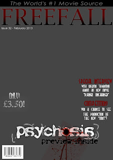
Below, I have included a foundation production for my magazine cover, without the background added. This is because we haven't taken the picture yet, but we've constructed the plan so it will make it easier to insert the picture when we do take it.

Poster Flat Plan
In the blue block, I aim to include the tagline of the poster. This will include the quote that will be used throughout my production "Keep your friends close, and your enemies closer". This will satisfy personal relationship, since it leaves an enigma code to what that could possibly mean. This will mean that the audience may want to find out what happens in the film, so it could intrigue them to come see the film. In relation to my semiotics research, the audience may try and decode the subtextual meaning of the tagline, which may intrigue them even more.
The green blocks will feature the main actors in this film. In terms of posters, this will be our "star attraction" that will attract audiences. This provides information, since the audience may be attracted to the film after noticing a big name on the poster. However, we are not able to exploit the "star status" completely, since our actors aren't well known. Therefore we are just following the convention of horror posters by using this feature in a similar way to they do, or else the poster may not provide enough information to intrigue our target audience.


No comments:
Post a Comment