Wednesday, 27 February 2013
Monday, 25 February 2013
Final psychosis trailer
We have produced our final trailer for our Psychosis production. After our first upload, I recognised the quality was quite poor and some clips were missing due to the rendering from Sony Vegas.
THIS VIDEO IS THE DRAFT
Therefore, I had to reupload the footage, so this is what we've got to present as our final trailer. An analysis of this will be included in our evaluation, on how we challenged and employed certain horror trailer stereotypes.
FINAL TRAILER
Audience feedback
With the help of previous research such as looking at other posters and using a questionnaire to construct our arious media texts, we have used facebook to help us meet the audience's wants and needs, by allowing their input to change our media texts.


Saturday, 23 February 2013

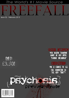
First draft of magazine cover
We have produced our first draft of the magazine cover. This has been posted on our facebook page, available for review and feedback.


Flat plan for 2D production
In preparation for my production, our group has planned out flat plans based on the research we have carried out. A flat plan is marking boxes on where certain features should be, such as cover lines, masthead, and focal point. Ensuring we have a flat plan will make it easier for us when we go to produce our actual covers, since all we have to do is slot images and text in place depending on where the boxes are placed. The flat plans were creating in Adobe InDesign Below, I have previewed our flat plans, as well explained the composition of our covers. I will also analyse the foundation of our poster with such techniques as semiotics and uses & gratifications.
Magazine Flat Plan


The yellow block will include the main focus point of the poster. In this block, the idea is to have the killer, Rachel, show half her face and for her to be covered with a black surrounding, similar to the poster research I've carried out. This will give a fear to the unknown, since the audience won't be able to depict her identity. This satisfies
The green blocks will feature the main actors in this film. In terms of posters, this will be our "star attraction" that will attract audiences. This provides information, since the audience may be attracted to the film after noticing a big name on the poster. However, we are not able to exploit the "star status" completely, since our actors aren't well known. Therefore we are just following the convention of horror posters by using this feature in a similar way to they do, or else the poster may not provide enough information to intrigue our target audience.
Magazine Flat Plan

The yellow block that I've put in the background is meant to represent the stock photo we aim to use in our poster. This will cover the whole poster, since this is what will be used to attract the audience. I aim to have a poster of the killer of the photo, which in this case, is Rachel. I will add grunge textures and some brush tools to create the effect of a distorted killer, with reference to such conventional horror killers as Chucky from "Child's Play", and Freddy Kreuger from "Nightmare on Elm Street".
The purple block in the foreground will be the main cover line of the magazine. In terms of uses and gratifications, this will satisfy information, since it will tell the viewer what the main purpose of the magazine is. This could also satisfy personal relationship, since it will be the main talking point of the magazine. This satisfies personal relationship since it will enable friends to talk to each other about the main talking point of the poster. This also promotes escapism, since the viewer will be able to essentially escape from reality, whilst reading that article.
The pink blocks will have cover lines, which won't be as significant as the main cover line. In terms of uses and gratifications, this will satisfy information as well, since it will include information on the sub-features of the magazine. It could also define personal identity since people may learn about these specific articles. Also, much like the main cover line, it satisfies escapism, since the individual will be able to distract themselves from everything else and focus on the article in hand.
The black block is where the date and issue line will be. This is a convention of magazines in general, and it satisfies information. The convention has been derived from my magazine research.
Above the black block, which I have forgot to include, will feature the masthead of the magazine. This is purely information, but if applied effectively, then it could serve as a instigator of escapism, as it will promote the magazine to the audience as a way to escape from reality in general.
The green block will feature a skyline, which will satisfy information, as it will include a unique selling point that may attract an audience.
Below, I have included a foundation production for my magazine cover, without the background added. This is because we haven't taken the picture yet, but we've constructed the plan so it will make it easier to insert the picture when we do take it.

Poster Flat Plan

In the blue block, I aim to include the tagline of the poster. This will include the quote that will be used throughout my production "Keep your friends close, and your enemies closer". This will satisfy personal relationship, since it leaves an enigma code to what that could possibly mean. This will mean that the audience may want to find out what happens in the film, so it could intrigue them to come see the film. In relation to my semiotics research, the audience may try and decode the subtextual meaning of the tagline, which may intrigue them even more.
The green blocks will feature the main actors in this film. In terms of posters, this will be our "star attraction" that will attract audiences. This provides information, since the audience may be attracted to the film after noticing a big name on the poster. However, we are not able to exploit the "star status" completely, since our actors aren't well known. Therefore we are just following the convention of horror posters by using this feature in a similar way to they do, or else the poster may not provide enough information to intrigue our target audience.
Researching horror magazines
For our promotion, we have also decided to create a magazine to help raise awareness for our film. Magazine is an above-the-line promotional strategy, which can be produced to a national, or global audience, which will attract a wide range of consumers. To understand horror conventions for a magazine, I have marked the conventions of a few horror magazines.
Now that I've labeled the composition of horror magazines, it's now time to distinguish between the conventions between a horror type magazine and a different genre based magazine.
Now that I've labeled the composition of horror magazines, it's now time to distinguish between the conventions between a horror type magazine and a different genre based magazine.
Tuesday, 19 February 2013
Setting up for audience feedback
In order to raise awareness, our group has set up a facebook page. Setting up a facebook page helps reach out to a wide audience, and we can gain feedback to help satisfy these multiple smaller audiences. Click here to see our facebook page.
Why use facebook to promote?
It is easy to set up, there is an already established audience that regularly uses facebook, and it is free to use.
 We have also created a banner and profile picture that is relevant to our trailer on photoshop. We have incorporated a few conventions of horror into these designs, to help suggest the trailer genre. The process of how we created the profile picture is shown below:
Why use facebook to promote?
It is easy to set up, there is an already established audience that regularly uses facebook, and it is free to use.

Thursday, 24 January 2013
Using non-profit music
For our trailer, we have to use music that won't leave us in a situation of breaking the copyright law. This would mean that if we use music without the permission of the producer, then we wouldn't be able to use the music. So far, we have been granted permission to use "Mad World" by Gary Jules. However, in order to create atmosphere, I don't think "Mad World" by itself would help represent the different atmospheres and emotions I attempt to achieve in my trailer. For example, at the beginning, I don't believe that "Mad World" would be appropriate to use in creating a casual atmosphere.
So firstly, what I did was I went onto google, and I typed in "no copyright music", so I can see what sort of websites come up that are related to this search. I then found a site named creativecommons (click on link to see the website), where it provides links to other websites which has a huge directory of music that we could use without the hassle of asking for permission.
After searching through several sites, I have found that BeatPick was the best site to use, as it is very easy to use and their search engine is very precise. After searching through a few song types, I have chosen two songs which could help create two very distinct atmospheres:
Friday, 18 January 2013
Researching Horror Posters
As part of our production work, we have been asked to produce a horror poster to help sell the movie. This works alongside the trailer that we've been working towards. Researching about horror posters will give me a better idea on how to compose my own horror poster.
 In this poster, it is evident that the poster is dominated by the black colour. This suggests an empty space, which leads onto the suggestion of mystery. Also, black connotes darkness, which is heavily relevant to horror. Also, the main focal point of this poster is the shocked look from the woman in the middle. Her facial expression suggests that there is a sense of danger and being alert, which foreshadows that something bad is going to happen. Also, the brightness and enlargement of the eyes implies that she is aware of what may happen. Also, with the black colour surrounding her, it implies isolation, since not much of her face is exposed on the poster. The grunge style effect that is added onto her face suggests distortion and instability. They have also used simple text, which just like logos, is easy to digest for the viewer. The title uses a sans serif font. Using a sans serif font challenges the stereotype of horror movies, since the font is usually meant to suggest high class, organisation, and superiority. However, it is quite the opposite, since they have used red to highlight danger and blood. It can also be argued that this text has been used to suggest that the killer is sophisticated, and the killer may be organised in the sense that they already have premeditated who their victims may possibly be. Also, they have switched the "R" in "Mirror", to suggest that the title is abnormal. This helps emphasise the horror genre, as being abnormal is related to horror events (with events being unexpected). Also, the use of white text not only is useful as it contrasts with the black background (making it easier to read), but it could also be suggestive of binary opposition (in respect to what white connotes e.g.. light vs dark, pure vs dark). They have also included the names of producers and when it's released at the bottom of the poster, which is a generic convention of horror posters.

I have also annotated these two posters to give myself an idea of how the structure of these posters should be planned out.


Colour in this poster have been used well. Again, white and black have been used to effectively contrast, but with the main focal point being in shades of brown to suggest dirt, there is one bright shade of red which stands out from the rest. Essentially, this is like breaking the monotonous colours used, which does heavily suggest danger. Moreover, the isolation with the black background have been used again. Also, simple text has been used, most likely for the same reasons as the posters before. Conventions of horror posters have also been used, with producers being named in the poster, and the title of the poster being on the bottom. The focal point, the female in the middle, has their head lowered and the hair draped over some of their face, which suggests that she's trying to hide their identity. This further implies that maybe she's a secretive and discrete killer, which suggests that the film may involve unexpected attacks, and possible scenes of false sense of security to scare the viewer. With the black background fading into the face, it shows that maybe the main focal point is welcoming the darkness, and she does not seem alarmed. This suggests that she may be the antagonist. Finally, the title "Lovely Molly" is ironic. This is because instead of love, horror films usually promote the complete opposite, such as destruction and death.

Thursday, 17 January 2013
Working within a budget
As we do not have the luxury of using high tech resources, it is essential that we grasp an understanding of how we can use what equipment we do have effectively. As a result, I have looked on YouTube at other student's media work, and compare it to high-budget productions, to compare the differences between both high budget and low budget trailers.
The importance of division of labour
Division of labour is splitting up the workforce in order to each individual's strengths. Division of labour will allow the production process to be sped up, and as a result, all areas of work will be up to a quality standard.
In terms of this project, there are 3 main areas that need to be worked on, and I have allocated roles with who should be working on what:
Theory/Pre-Planning - Myself
This includes looking at research, and writing up the base of the trailer, so the group has a clear understanding of what the trailer looks to achieve.
Filming/Editing - Will
This includes working on specific shots whilst filming, and see what type of clips will look good in the composition set for the trailer.
How will this effect my horror trailer?
Understanding division of labour is important, since we are able to speed up the process of which we can complete our trailer. The faster we complete the trailer we have in our time limit, the more time we will have to redraft our trailers and complete it to the best of our ability.
Production: First draft of the opening sequence
With the knowledge I know, I have produced a first draft of the opening sequence.
Firstly, I have used calming music to help give off the impression that it is a trailer suggestive of a genre that is soothing and relaxed, as opposed to presenting the horror genre straight off the bat. This is unlike other horror trailers, where they want to build suspense up straight away by using eerie music to begin with. Also, I use this music with the information of what audience should be watching this, as well as the production logo to give credit to their work. However, it is important to note that the green screen information is not the actual one that I will use for the final draft, since the information is inaccurate (like it shows that it's from America when it's produced in the UK). I am only using that as a reference.
However, suddenly, there is a static sound, and PAL colour bars that are seen on a TV, to give off a distorted effect, and catch the viewer from a false sense of security. This also helps imply the horror genre, as the distorted effect help suggest that it is something that you would not expect, but also gives the viewer a shock. Giving the viewer a shock is the intention that we aim to give off, since the horror genre is intended to shock and scare the viewer in a sense of surprise.
We then go on to intertitles where there some insight to the main character's thoughts. Not only is this applying enigma codes to my trailer, but it also helps the viewer understand the trailer. For example, "Why did this happen to me" has the viewer guessing on what did happen to this girl. Also, since the spotlight is constantly on the girl, it shows that she is the main character, and does imply that the quotes are coming from her point of view in an ominous way.
We then continue to tell the story in a consecutive way, showing that the girl's take pictures, and the camera shots are shown. This is so the viewer understands the disruption that is being created.
Production Logo - "Skyline Productions"
Based from the research I have done on logos, I have created a production logo which will be used in our horror trailer.
 This follows the same rule as any other logo would. It is simple, as it clearly shows the silhouette of a skyline, with a blue to white gradient. I've used these two colours, as it connotes a calm, and soothing atmosphere. It could also suggest the reflection of water on the skyline, which leads on to the suggestion of nature.
With the text, I have made it big and spread out enough for the viewer to know what the name of the production firm is. Using bold text has also helped in this instance, as it is easier to read than other fonts types such as "san serif". No other effects have been used on the text, as I want to keep this as simple as possible. The more simple the logo, the easier it is for the audience to digest. However, I did have to make sure that there was some link between the design and text, otherwise the skyline design could've been suggestive of anything. The two aspects compliment each other.

With the text, I have made it big and spread out enough for the viewer to know what the name of the production firm is. Using bold text has also helped in this instance, as it is easier to read than other fonts types such as "san serif". No other effects have been used on the text, as I want to keep this as simple as possible. The more simple the logo, the easier it is for the audience to digest. However, I did have to make sure that there was some link between the design and text, otherwise the skyline design could've been suggestive of anything. The two aspects compliment each other.
Wednesday, 16 January 2013
Logo research and analysis/Conventions of the very beginning of the trailer
A logo is used to represent someone or something. Whenever a
specific logo is seen, then it usually refers to something, and is therefore, symbolic.
The most common feature of a logo is that it has to be simple. It is known that
if a logo is too complex, then the consumer may not remember the logo as well
as they could do, and therefore, it will slip their mind. Below are a few
examples which follow this rule:

This is the "firefox" logo. As you can see, this is not
complex at all. It is relevant to what it sells, and the name. A gradient that
is similar to fire’s colours are shown on the fox, as well as it being wrapped
around a world. The world is implemented in this logo to imply that this is
relevant on a global scale, which it is, as this provides a service to roam
the internet.

This is the Batman logo, commonly used in its comics and
films. They have used a simple shape (an oval) as the base of their logo, and
used a bat in the middle, which is relevant to the name of their brand. They
have also used distinct and contrasting colours, as it emphasises the colours
and more importantly, the bat in the middle. No complex graphic effects have
been used here.
However, in relevance to our trailer, I have to produce a
production logo before the actual screening of the trailer. This is to give an
authentic feel to the trailer, but also to avoid copyright if I was to use
existing production logos/animations. Below are some production logos that
follow the same conventions as the logos above:


"MGM" are also a very recognised film production firm. Their most notable film that they have produced is the series of "James Bond". Although their logo may seem more complex than the others I've mentioned, it does get their point across. The use of the lion is the most noticeable symbol out of every other aspect of the logo, as it's the easiest design to recognise. Also, they have used one colour for their logo (predominantly gold). Also, the production firm name is on the top of the logo, without any inference of other designs, which makes it easy to read. However, the other computer generated images (CGIs) make this logo a bit confusing. This means the viewer may not remember the whole design, but most noticeably the lion. The lion is also emphasised in animation, through the roar sound effect that MGM have added in:
Pixar have produced many famous films, such as Buzz Lightyear, Toy Story, Monsters Inc., and Finding Nemo. This logo that "Pixar" uses is essentially just text. However, as simple as it is, there isn't a design or symbol that can be linked to the production name "Pixar". However, the use of san serif font symbolises that this is a production firm that representative of high class. Below the production name, they have included what type of company they are, which is informative to the viewer. As plain as this logo is, it follows the same convention as the logos that I've mention before: Simple.
How will this affect my horror trailer?
Understanding the conventions of a logo will allow me to create an effective logo that I will look to include in the trailer. None of these logos are specific to a genre, as the production firm have nothing to do with the involvement of the trailer. It is important that I create an effective trailer, so it is easy for the consumer to digest the information that is given to them in such a short amount of time. Usually in trailers, the production logo does not appear for more than 5 seconds, so the viewer would not have enough time to see the logo. I have featured various examples below, as well as indicate how many seconds the production logo shows up for, and between what times:
Great Gatsby - 2 seconds (0:06 - 0:08)
Dark Knight Rises - 4 seconds (0:06 - 0:10)
Love Actually - 3 seconds (0:06 - 0:09)
It is also important to note that whilst finding out about the logos within the trailers, I have noticed that the green screen with information of age group restrictions at the beginning lasts for exactly 6 seconds, including any transition effects that may be included. It is also important to note that it is 6 seconds in the beginning, despite the genre of the trailers being different. I can conclude that the genre of the trailer has no effect to how long the information is displayed in the beginning. Therefore, as it is a convention of a trailer, I will apply that into my trailer so it doesn't seem any different to the other trailers that have been produced for professional purposes.
Subscribe to:
Posts (Atom)